Building an accessible editor at Moonpig
This is a cross-post: I provide canonical versions of blog posts I have written on different websites. This blog post was written for Moonpig Tech Blog
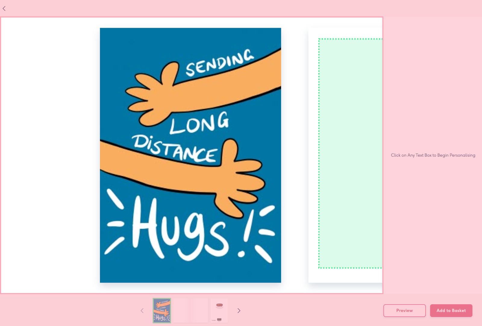
Hello, I am a developer on the Editor Team at Moonpig and we are currently working on replacing our 7 year old editor tool. If you aren't familiar with what we do at Moonpig, we provide customers the ability to purchase and personalise cards or gifts for loved ones. The editor tool is part of the core user journey with most customers at some point visiting the editor to personalise a gift or card.
The new editor will be based on new technology, have better performance and meet accessibility standards, something that has caused difficulty for some of our customers in the past. We want Moonpig to be inclusive so that anyone can create and send cards and gifts to their loved ones.
We have been re-platforming for the last year at Moonpig and my team is responsible for re-platforming the editor tool. We decided we would rebuild the editor rather than port the current editor to the new platform. It is part of the core user journey and is currently one of our biggest drop-off points for customers. With the original editor, 20% of customers dropped off or did not proceed to purchase.
Over time it has become more difficult to iterate with requirements outgrowing the original architecture and with the original team gone. At Moonpig we now use React exclusively on the web but the original editor was built using Angular 1, a technology most developers have long forgotten or moved away from.
Subscribe to my newsletter to keep upto date with blog posts, tutorials and thoughts each week.
The original editor also made use of <canvas>. Canvas is an HTML element that can be used to draw graphics via JavaScript and the output is a Raster image. We know from the current editor that Canvas can be quite challenging in some circumstances such as calculating line breaks and isn't accessible because the browser cannot interact with the elements within the canvas element.
It is also not suitable for printing which means we have one rendering engine for the website and one rendering engine for printing which can lead to differences between preview on the web and the physical product printed.
Choosing SVG
Our new editor makes use of SVG and this comes with several advantages over Canvas. In this blog post, I want to talk about one of those advantages which is accessibility.
The editor surface renders as one SVG, we do this because it allows us to manipulate the viewBox for navigation, swipe gestures and zooming in on individual elements within a card.
SVGs are typically treated as images in which alt text is used to describe the image, this means individual elements within the SVG are not accessible by default.
We have to take additional steps within the SVG to describe the content of the SVG to the browser. We can do this because SVGs are written using XML-based markup similar to how HTML is written. This means the browser can access those elements via the DOM to provide keyboard and screen reader navigation.
Typically on webpages you create headings to provide structure so content is easily digestible. We wanted to do something similar within the editor where each page of the product has its own heading. The heading for each page describes what page you are on and how many elements exist within that page. Without headings, screen-readers would see a list of editable elements but not have the context to inform the user what page those elements belong to.
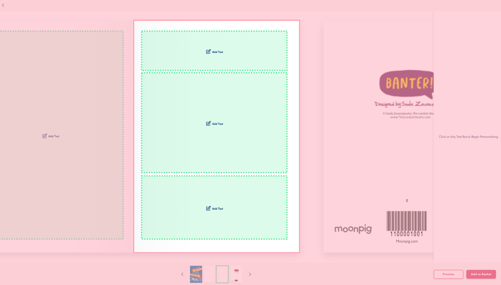
One feature of SVG we leverage is the ability to embed HTML content so that we can enable headings for each page. SVGs provide an element called <foreignObject> that allows us to embed HTML content directly within the SVG. We use this element to render an offscreen <h2> tag providing screen readers hints to describe what page is currently being edited. The headings also describe how many elements exist within that page.
Originally we made use of aria-labels for each page region but we decided on the <foreignObject> approach because when a user decides to change the page within the navigation toolbar, we update the document.activeElement to the page <h2> element so that they can jump straight to the page they want to edit.
<foreignObject>
  <span>
    <h2 tabindex="-1" aria-hidden="false">
      Inside Bottom. 3 editable elements on this page.
    </h2>
  </span>
</foreignObject>
Editing Text Elements
One feature we are particularly proud of, is the idea that a user should see a visual representation of the product when they are entering text or updating the styles of a text field. This is useful for users who may have a cognitive disability where memory function is affected. It means a user can remember what a card looks like without having to change the page and lose focus of the current undergoing task.
We require parts of the SVG to be focusable so that the user can interact with the product they are editing. This is usually possible within a standard HTML document by using <button> elements. Unfortunately, SVGs do not support <button> elements but they can use <a> elements within the body of the SVG. We use <a> for all of our interactive elements and apply an aria-role=button to signal to the browser that these elements are in fact buttons and not external links.
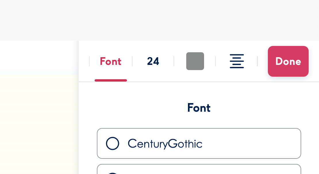
We made text editing possible by using foreignObject and inserting a <div> as a child with the contentEditable attribute applied to that element. We chose this approach because it gives us more control over styling than a normal <input> field.
The styling options make use of a library called @reach/tabs. This library handles keyboard and screen reader navigation for tab-based user interfaces. We decided on using a tab ui pattern because we didn't want to overwhelm the user with too many options in one view.
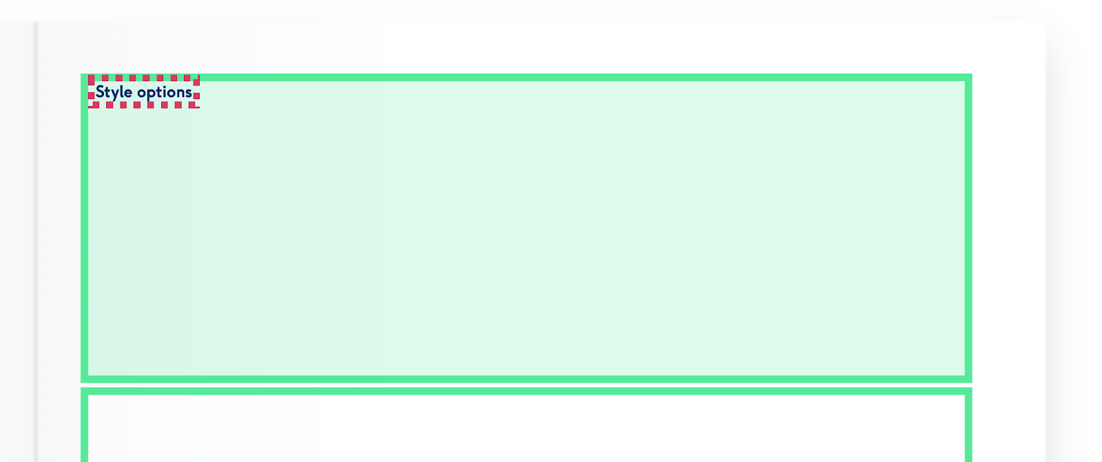
When developing the text styling options, we wanted to provide keyboard navigation that would not hinder the navigation between different text elements. A text element may have multiple style options and it would require too much effort for a user to navigate through all the available options.
To get around this problem we render the style options elsewhere within the DOM and place a <button> between each text field that is only visible when the button has focus. This allows a user to move their focus to the style options or skip over the style button to the next text field.
Some text elements also have a maximum character limit and we display how many characters are left.
For screenreader users we wanted to alert a user once they've reached the maximum character limit, we do this by making use of aria-live set to assertive and update the messaging once the limit has been reached.
<div aria-live="assertive">Maximum character limit of 10 reached</div>
Summary
SVGs are very powerful and can be used for more than just static images. They provide helpful APIs and elements to make content interactive and accessible within the browser.
We have only just begun this journey of rebuilding the editor and whilst we have made good progress on accessibility, it is an on-going effort and we will always strive to do what's best for our customers.
You can find out more about how we automate accessibility testing here.
Subscribe to my newsletter to keep upto date with blog posts, tutorials and thoughts each week.